Maryam Ghafoori
UX/UI Designer
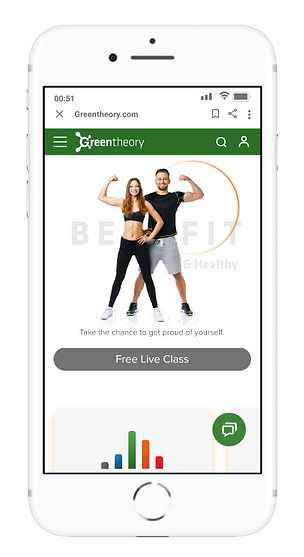
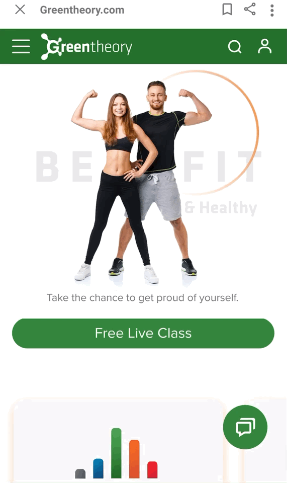
Orangetheory fitness is categorized in specialized gyms. They are successful because they implemented the idea of heart rate monitors being showcased during the workout which helps build friendships and provides motivation. Also, people like it because friends can go to different locations but still “challenge” one another to see how well they stayed in the fat-burning zone. However this gym only has face to face classes which due to covid, the number of users decreased. Also it seems the website has series of complexities in the online registration process.
Objective
We were given five weeks to design a gym website in line with Orangetheory but with a new name, some new features ( adding online classes) and less complexity.
Challenge
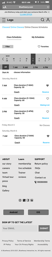
Adding virtual classes that gives user the same feeling as they had in face-to-face classes which means monitoring heartbeat, showing your heart zone and being able to exercise with others at the same time.
The Goal
Improving the user experience design which will both lead to attracting more users and more profitability.
User Research
User Testing
We recruited users who met the websites target demographic to test the existing website.
The user path was complicated, and they didn’t find the information they needed very easily. Also, the registration process was difficult for them and sometimes discouraged the users due to lack of transparency.

User Journey Map
It was a very useful tool for documenting project requirements, identifying gaps and pain points.

Survey and Interview
After selecting some questions, our team sent an online survey to get a better sense of what is lacking. Also, we conducted a series of interviews to better understand the problem this project was attempting to solve. Our questions centered on understanding users goals and needs for online classes.


Affinity Diagram
Once we had a clear list of requirements that user wants (likes/dislikes) we conducted a card sorting exercise to organize our information better.

Competitive Analysis
In order to understand this industry and find out where the product currently fit within the market, we conducted a competitive analysis. We focused on companies with a similar target market. Many of orange theory competitors had online classes and we investigated those to see how they designed their website for offering online packages.


Summary
Overall, from research we determined our three top product goals.
1.Design a simple and practical website
2.Our main goal and focus should be online classes due to covid situation and increasing user request for this matter.
3.Preserving the main features and goals of the gym during the new design
Starting the Design
User flow
We created multiple user flows for each task. We made sure to include multiple access points and a clear start & finish.

Information Architecture (Card Sorting)
Every content in our product was organized and structured through card sorting in a way that made sense to the user, met their expectations and enhance the product functionalities.

Wireframe

We created wire frames to map out the website structure and page layout. These were great for communicating the design vision.
Usability Study Findings
The usability test was conducted again with the new website. Feedbacks this time was much more positive but still we needed to change some parts based on out users responses.
-
The information in the homepage was too much and got the user confused.
-
User confusion due to the use of different word that all had the same meaning, like Book Now and Reserve.
-
We had some features that were not understandable by the user and needed to change a little. Like adding plus icon for the calendar so the user understands how to look at future days and months for class availability.
Refining the Design


High-fidelity Prototype

Interactive Prototype:
Accessibility Considerations
-
We had color contrast in our design so all users can see it easily. For the typography We tried to minimize the amount of text and it was large enough to be seen easily.The key information's where visible and easy to find. They
-
where step by step and classified so the users brain could analyze it easily and by clicking each part it goes to that page directly.
-
All buttons are big and clickable and the links are recognizable and underlined.
Overall the feedbacks were positive. People where comfortable using this website and they not necessarily needed going to the gym for registration. They where able to do the whole process online as it was very simple and understandable. People with kids or full time jobs which were also interested in Orangetheory, now where able to have the same feeling at home.
-
Add an online nutrition consultant to our features.
-
Adding online private consultation with a Physiotherapist
-
Adding a short form for the users to indicate their satisfaction or dissatisfaction.
Going Forward
Impact
What I learned
My team members and I spent weeks brainstorming about this topic. Adding online classes was a challenge for us because we were trying to keep orangetheory goals and feelings in the same track. I learned working as a team and not giving up will be the best solution for the best designs. This project improved my communication skills and allowed me to easily work with a team with different backgrounds. We are so incredibly proud of this project because we think we reached our expectations.