Maryam Ghafoori
UX/UI Designer
Mari & Mia Gift Box Design
Offers a Diverse Range of Ready To Ship Gift Boxes

The Product: Website
Project Duration: May 2023- July 2023
My Role: UX Researcher, UX Designer, UI Designer
Mari & Mia Gift Box Design is an e-commerce website that specializes in offering a diverse range of ready-to-ship gift boxes. The website seeks to provide customers with a seamless and enjoyable gifting experience across various categories and occasions. Through this research, we aim to assess customer satisfaction, website usability, and the overall success of the business model.
Groupe age that mostly where interested in plants:
Problem Statement
Based on the information provided by the product manager I realized that the Mari and Mia Gift Box design website faces a two-fold challenge: a high user drop-off rate after opening various pages without adding items to the cart, attributed to users struggling to identify the most suitable gift choice; and a significant cart abandonment rate of 70%, particularly at the registration stage, due to the mandatory account creation for purchases.
Research
To ensure a well-informed and effective website design, I initiated a comprehensive research approach. Beginning with:
User interviews, and continued with a secondary research and competitive analysis.
User Interview
From the user interviews, I gained valuable insights and perspectives that provide a deep understanding of users' experiences, preferences, and pain points.
1. Importance of Guest Checkout: I learned that guest checkout is crucial to users, as they prefer not having to create an account just to complete a purchase. This insight indicates that implementing guest checkout could potentially reduce cart abandonment.
2. Need for Categorization: Users expressed a clear desire for categorized gifts, indicating that this feature would significantly enhance their browsing experience and help them quickly find suitable options for different occasions.
3. Desire for Discounts and Incentives: Users mentioned that discounts, offers, and hassle-free checkout processes could positively influence their decision to complete a purchase.
4. Visual Clutter: Users provided feedback about the cluttered visual appearance of the website and expressed a preference for a more organized and minimalistic design and they are not interested in the websites that provide too much information.
5. User-Friendly Navigation: Users emphasized the importance of clear navigation and user-friendly interfaces to make their browsing and selection process smoother and more enjoyable.
Affinity Diagram
I used an affinity diagram to organize the information I received after conducting an interview. This method allowed me to categorize and group similar ideas, creating a visual representation of the patterns and themes that emerged from the interviews.
.png)
Secondary Research ( Literature Review)
I conducted a literature review to understand existing trends, best practices and user behaviors in the realm of online gift shopping.
-
Based on literature reviews, peoples' interest in getting online gift boxes increased significantly due to the Covid-19 pandemic and the global gift box market is expected to reach 3459.3 million US dollars by 2032.
-
The Gift Basket Industry has a diverse customer base, with individuals and corporations both making up a significant portion of the market.
-
Both men and women are likely to purchase gifts for different events like Valentine’s Day, birthdays. … and this could be an opportunity for companies to create products that appeal to both genders.
-
There is a large potential for online sales during the holiday season (Christmas). It's very important for gift box companies to make sure they have gifts for any reason or season.
-
The gourmet food gift basket segment captures nearly 60% of the gift box market. This is a clear indication that gourmet food gift boxes are a top choice for gift-giving, and should be taken into consideration when discussing the gift basket industry.
An empathy map helped me generate a deeper understanding of persona’s thoughts, feelings, needs, and pain points. It guided me through decision making, prioritizing features, and designing an application that meets the needs, desires, and emotional well being of the identified persona.
Competitive Analysis
Target


Likes:
-Categorized
-Easy navigation
-Different shipping options.
-Having two different colors for the buttons of checkout or continuing shopping is a good option to use because users don’t get confused.
Dislikes:
-In the check out process they don’t have the option for guest checkout and you have to login or make an account.
Macys


Likes:
-You can easily find the category that you like in the Homepage and also find the recommendations for the user so they can easily get help and find the proper item.
-There are items in the homepage related to the season for example now they have beginning of the school year options.
-There is a guest checkout option.
Dislikes:
-Before checking out there is an option of two buttons ( Add to bag and Buy now) which I
personally get confused about.
-I don't like the way you can choose paying options because there is a credit card and card type which can be a little confusing.
Pottery Barn Kids


Likes:
-In the navbar there is an option for best sellers.
-You can easily choose the category like ( chairs) and choose again between them based on your need.
-The price of the item selected, the description and the amount you can choose is very visible and easy to use.
-There is a guest checkout option.
-Payment options are very easy to understand and choose. Buttons are big and visible.There's different pictures of credit cards as samples.
Dislikes:
-Two options of checkout and Paypal checkout are a little confusing.
Research Synthesis
In the process of research synthesis, I employed two crucial tools, namely personas and customer journey maps. These synthesis tools collectively empowered me to tailor the website design to cater to user needs, ensuring a seamless and meaningful journey.
Persona
Personas enabled me to distill the diverse user insights and behaviors obtained from interviews, creating representative profiles that encapsulated key user characteristics, motivations, and pain points. These personas served as relatable user archetypes guiding the design process.
.png)
.png)
Customer Journey Map
Crafting customer journey maps allowed me to visually depict the entire user experience from discovery to post-purchase engagement. By mapping out touchpoints, emotions, and pain points throughout the journey, I gained a holistic understanding of user interactions, which informed design decisions and solutions aimed at optimizing each step of the user experience.
.png)
User Flow
Creating a user flow diagram allowed me to visually map out the entire journey that user takes while interacting with the website. This visualization helped me understand the sequence of actions, decision points, and interactions from the user's perspective.
.png)
How might we redesign the Mari and Mia Gift Boxes website to effectively address users' struggles in selecting the best gift, reduce cart abandonment at the registration stage, and optimize the overall user experience?
Low- fidelity Wireframes
Creating wireframes helped me translate the user journey into tangible design concepts, focusing on the layout, structure, and functionality of each screen. By visualizing the core elements and interactions early in the design process, I could quickly iterate and refine my design ideas, ensuring alignment with the user flow and addressing any potential usability issues before moving on to more detailed design stages.
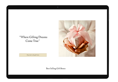
Homepage

Filter the gift boxes based on your need


Description of the box you have chose

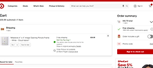
Add to your card

Checkout as guest

Shipping information

Payment

Contact us

About us

Following the creation of low-fidelity wireframes based on the user flow, I conducted a crucial first round of user testing. This testing phase allowed me to present users with the preliminary design concepts, gathering valuable insights into how they interacted with the website's structure and functionality.
Findings from Round One of User Testing:
Browsing Experience: Participants found the browsing experience satisfactory overall. Most users could easily locate gift box options for specific occasions, such as birthdays, weddings, and holidays.
Guest Checkout: Participants were very happy that the website had a guest checkout option. Overall, users felt relatively comfortable proceeding with the checkout as guest users.
Finding Best Sellers and Options: Participants appreciated the variety of gift box categories and users agreed that buttons placed closer to the product pictures ( best sellers) would improve the user experience and make it easier to interact with the website.
They also mentioned that if we add another picture for the box we chose to show what it contains, it will be much better.
Home Page Information: Participants perceived the home page as visually appealing, but a few found it overwhelming due to the abundance of information presented. Users recommended a more minimalistic design approach to improve the focus on essential elements and reduce visual clutter. Also suggested to place buttons closer to the product pictures.
Informed by the insights gleaned from the first round of user testing, I proceeded to develop high-fidelity wireframes for the gift box website. Prior to this, I carefully selected a design style that resonated with the website's objectives and user preferences. This deliberate approach ensures that the upcoming design iterations will not only address the identified usability concerns but also embody a cohesive and visually appealing interface that enhances the overall user experience.
Design Style
.png)
High- fidelity Wireframes
After creating the high-fidelity wireframes, I conducted a second round of user testing. This phase aimed to validate the refined design concepts based on the changes made from the findings of the first round of testing.
Users expressed a preference for some adjustments to the color scheme, specifically suggesting changes to the button colors for better visual contrast and readability.
Personalization Option:
-
Personalization was identified as a significant factor for users, and participants expressed a desire for an option to personalize gift messages.
-
Users emphasized the importance of being able to add heartfelt messages to the gift boxes, as it adds a personalized touch to their gifting experience.
The user feedback revealed a positive reception towards the inclusion of discount offers on the website. (We planned to implement strategically placed pop-up offers on the home page, to encourage further exploration of our website).
Homepage
.png)
Filter the gift boxes based on your need
.png)
.png)
Description of the box you have chose

Add to your card

Checkout as guest

Shipping information

Payment

Corporate gifting

Interactive Prototype
Conclusion and After Thoughts
Furthermore, I will introduce a new feature that allows customers to exercise greater control over their gift boxes. This feature will enable users to add or remove specific items, tailoring the contents based on the recipient's preferences. Also I will think of expanding on the customization options for gift messages like including the option to upload pictures and add it to their gift box.