Maryam Ghafoori
UX/UI Designer
Plant Minder
Making Plants and Plant Lovers Happy and Healthy
The Product: iOS Application
Project Duration: Dec 2023- May 2024
_edited.png)
Plant Minder is a user-friendly iOS application that helps plant enthusiasts care for their plants. With personalized recommendations, reminders, a photo diary, and a supportive assistant, it simplifies plant care and helps users to increase their knowledge and become successful plant caretakers.
My Role: UX Researcher, UX Designer, UI Designer

Groupe age that mostly where interested in plants:
Keeping plants healthy needs knowledge
Problem Statement
Since 2019, there has been a noticeable increase in people's interest in keeping and buying plants. This growing trend can be attributed to several factors such as wellness and mental health, urban gardening and green spaces, social media and influencer culture, sustainability and environmental concerns and at the end, aesthetics and home Decor. The growing interest in plants has led to increased demand, resulting in higher prices in the market. Many individuals invest significant amounts of money in purchasing plants, but don’t have scientific knowledge to effectively care for them and need help in this regard. To address this issue, it is important to provide accessible resources on plant care. I needed a solution that would be right in the user's hand and easily accessible. Something that would solve their problem and help users in taking care of their plants.
Solution
The purpose of the project was to create an interactive plant care application to address common challenges faced by plant users and help them in taking care of their plants by offering personalized recommendations based on individual plant species. By empowering the user with the necessary knowledge and support, they can feel more confident in their ability to care for their plants effectively, decrease the stress associated with their investment and encourage them to buy more pants.
My Role
As a sole designer for this project, I was responsible for the entire process, that is, the research, designing, Wireframing and prototyping.
The Process

Research
When initially conceptualizing my plant care app, I had a vision in mind. However, I recognized the significance of conducting extensive research to truly understand the needs and pain points of potential users.
Survey
I designed and distributed a survey to reach a wider audience of plant lovers. The survey aimed to collect quantitative data and feedback from both novice and experienced plant enthusiasts.
Groupe age that mostly where interested in plants:

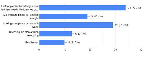
Survey questions revealed several main concerns among the users:
Interview
I also conducted a series of user interviews with five passionate plant enthusiasts. These interviews aimed to understand their experiences, challenges, and expectations in caring for their beloved plants. Bellow are some key questions that were asked during the interviews.
-
What are the biggest challenges you face in taking care of your plants? Are there specific issues you encounter regularly?
-
How do you currently keep track of your plant care routines, such as watering, fertilizing, and repotting?
-
What sources do you rely on for plant care information?
-
Can you describe your typical plant care routine?
After Analyzing Survey data and Interviewing with users Valuable insights were gathered:
-
Having plants is becoming a lifestyle and people need some sources to get information about plants. Participants used online resources, books or sometimes got advice from local nurseries. However, they all had a very busy lifestyle and didn’t have enough time to read long articles and they expressed a desire for a centralized platform that provides reliable and personalized recommendations for their plants.
-
The most common concerns expressed by participants revolved around difficulties in determining specific care requirements for different plant species, maintaining consistent watering and fertilizing schedules, and identifying and addressing plant health issues.
Affinity Diagram
I used an affinity diagram to organize the information I received after conducting an interview. This method allowed me to categorize and group similar ideas, creating a visual representation of the patterns and themes that emerged from the interviews.

By analyzing the affinity diagram, we gained insights into the pain points and other valuable information expressed by users. These findings helped us identify common challenges, preferences, and needs related to plant care.
Challenges and Pain Points
-
Lack of plant care knowledge and guidance.
-
Difficulty in plant identification and specific care requirements.
-
Inconsistent watering and fertilizing schedules and uncertainty in proper watering and fertilizing techniques.
-
Troubleshooting plant health issues.
-
constraints and difficulties in managing plant care alongside busy schedules.
Understanding these pain points allows us to prioritize and address these specific challenges through the development of the plant care app, ensuring that users receive the necessary support, information, and resources to overcome these obstacles and successfully care for their plants.
Persona

Empathy Map

An empathy map helped me generate a deeper understanding of persona’s thoughts, feelings, needs, and pain points. It guided me through decision making, prioritizing features, and designing an application that meets the needs, desires, and emotional well being of the identified persona.
“How might we create a seamless and intuitive user interface that simplifies plant care tasks and empowers users to confidently care for their plants?”
User Flow
Based on the findings and insights, I began creating user flows for my most crucial features within the plant care app.


User flows helped me to identify the key actions, decision points, and information required at each stage, allowing me to visualize the sequence of screens and understand how users will navigate through the app and interact with its features. This information serves as a foundation for sketching the various screens and interface elements that will fulfill the user's needs at each step of the flow.
Sketches


After conducting user testing on hand-drawn sketches, I gained valuable insights into areas that required improvement and were found confusing by users. Some of the identified changes included:
-
Rearranging the order or placement of features to enhance usability and logical flow.
-
Taking out the process of selecting photos from the album to make it more understandable for users.
-
Revising or rethinking the approach to explaining how to capture pictures of plants, ensuring clarity and user understanding.
-
Ensuring consistency in typography throughout the app to create a cohesive and polished visual experience.
-
Evaluating the information presented on different pages, such as reconsidering the placement of plant care tips from the reminder page to the explore page for better organization and user accessibility.
Low- fidelity Wireframes
Sign up
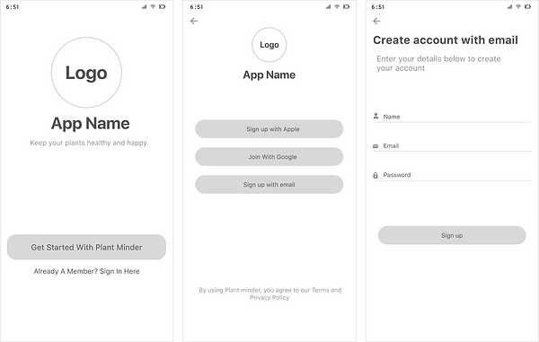
Homepage
.png)
Diagnosing
.png)
.png)
.png)
.png)
Identifying
.png)
.png)
.png)
Explore
.png)
My Plants
.png)


Adding Reminders


Moodboard and Design style
.png)
.png)
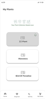
High- fidelity Wireframes
Sign up
.png)
Homepage
.png)
Diagnose
.png)
.png)
Explore
.png)
.png)

.png)
Identifying


.png)
My Plants
.png)
.png)
.png)
Adding Reminders
.png)
.png)

.png)
.png)
User Testing:
After the prototyping stage, I conducted two rounds of usability testing to evaluate the ease of interaction with the app. In the first round, I created specific tasks for participants to perform, allowing me to observe their interactions and assess the app's usability.
During the first round of usability testing, users provided valuable feedback and suggested several changes to improve the app's user interface (UI) and user experience. Some of the suggested changes included:
1. Some changes to the home page to ensure that all important features are easily accessible without the need for excessive scrolling and allows quick access to essential functionalities. Also some changes to the user interface and place of different features.
2. Modifying the color of the icon that indicates a sick plant to make it more visually distinguishable.
3. Considering removing or minimizing the repetition of the word "plant" in the explore page. Users felt that the
purpose of the explore page, being related to plants, was already evident and didn't require excessive repetition.
Overall, the changes made to the prototype based on the feedback from the first round of testing were successful. The majority of participants found the application to be easy to use and navigate. Participants were able to complete most of the tasks with minimal difficulty.
.png)
.png)
.png)
.png)
.png)
.png)
Interactive Prototype
Click through the app here >
Conclusion & After-thoughts
This Case Study has been a challenging yet rewarding one for me. I have had this app idea for a startup company of a client and finally as a UX/UI Designer I was able to bring it to life. Designing the application from scratch has been a valuable learning experience, allowing me to grow both as a designer and researcher. Witnessing the validation of the app's effectiveness by its intended users is incredibly gratifying. Throughout this project, I pushed myself to work hard and maintain consistency and I am proud of the results achieved.
There are several valuable features that could be considered for future additions to a plant care app such as:
1. Community Forums: Creating a platform for plant enthusiasts to connect, share experiences, ask questions, and provide advice to fellow users. This fosters a sense of community and encourages knowledge-sharing among plant lovers.
2. Marketplace: Integrating a marketplace where users can buy or sell plants, seeds, gardening tools, and related products. This adds convenience and enhances the overall plant care experience.
3. Working on the search bar and thinking of the features that we can consider for this part.